Components
Tooltips
Default tooltip of Material UI with arrowhttps://material-ui.com/components/tooltips/#arrow-tooltips
Content tooltips
Background:TXT - dark
Color: Neutral lighten-5
(general font face & size)
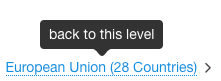
Items with tooltip have dotted underline:
border-bottom: 1px dotted Default;
Background:TXT - dark
Color: Neutral lighten-5
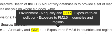
Highlight:
color: TXT-dark;
background: yellow;
padding:0 2px;
border-bottom: 2px solid highlight-2;
(general font face & size)
Information tooltips
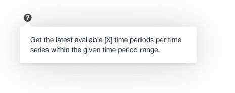
color: TXT - dark;
box-shadow: 0 0 20px 4px rgba(154, 161, 177, .15), 0 4px 80px -8px rgba(36, 40, 47, .25), 0 4px 4px -2px rgba(91, 94, 105, .15);
background-color: Neutral lighten-5

(general font face & size)