Components
Filters
Global
Filter titles:
margin-bottom: 10px;
border-top: 2px solid Neutral;
padding-top: 2px;
font-family: "PT Sans Narrow", "Helvetica Neue", Helvetica, Arial, sans-serif;
color: TXT - light;
font-size: 15px;
line-height: 22px;
font-weight: bold;

Pinned facets:
Icon after facet name:
material-lens
vertical-align: super;
font-size: 5px;

Filter title badges:
border: 2px solid highlight-2;
padding: 2px 4px;
font-size: 12px;
line-height: 1;
color: TXT-light;
border-radius: 4px;
margin-right: 24px; (24px from the end of the line)
margin-top: 2px;

Filter title open/collapse icon link:
// icon-chevron-down, icon-chevron-up
font-size: 18px;
line-height: 1.5;
top: 0;
right: 0;
color: primary;

Filter boxes:
margin-bottom: 25px;

Filter box content:
font-size: 12px;
line-height: 16px;
category color: Neutral darken-4;
separator line:
border-bottom: 1px solid Neutral lighten-3;
margin: 4px 0;
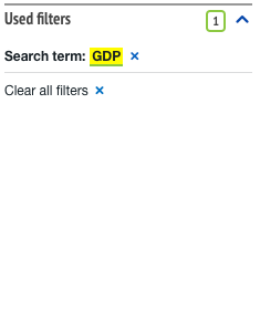
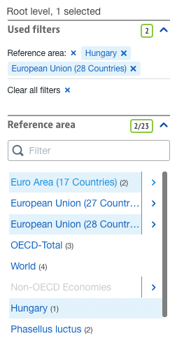
icon: icon-cancel
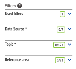
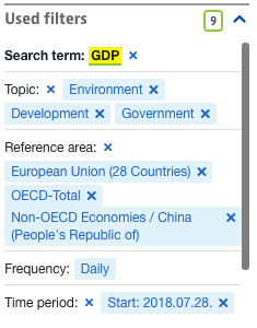
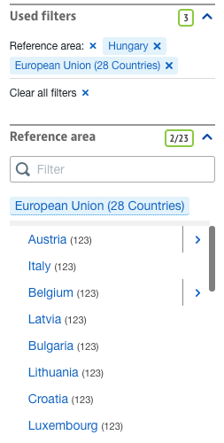
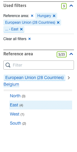
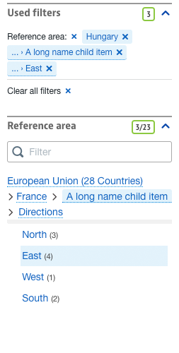
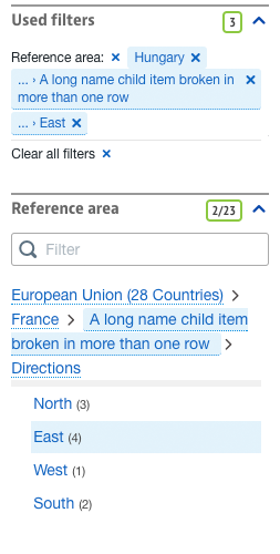
- if we have 1 or more filters selected, then there is the clear all filters option on the bottom
- if we have keyword, it is also highlighted, and is also clearable.
- only the "search term:" text is bold, all the other filter type texts are normal weight
max-height: 250px;
overflow: auto;

filter tags:
background: default - light;
color: primary;
padding: 2px 6px;
border-radius: 3px;- filter types are separated with line
- filter items can be removed one-by-one or the complete type can be removed, also there is a clear all option at the end
color: primary;
padding: 0px 5px 0px 3px;
height: 30px;
width: 100%;
border-bottom: 1px solid Neutral lighten-5;
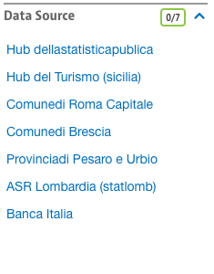
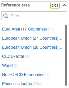
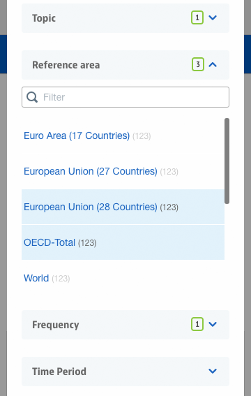
font-size: 14px;- if the item of the list is longer than the width of the box, it doesn't shows, it ends in ...
color: Neutral lighten-2;
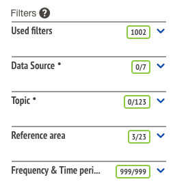
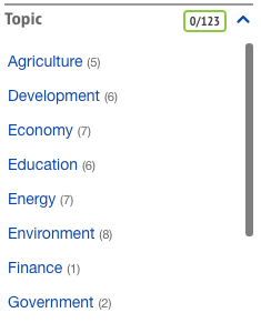
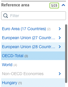
font-size: 12px;- the number (n) shows how many results we have under that filter item
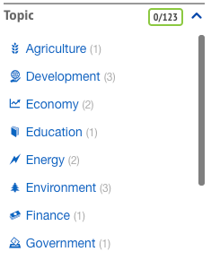
color: primary;
font-size: 14px;
width: 18px;- font icons before the text
Filter search
filter input
margin: 0 0 15px;- simple search input with icon
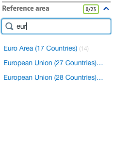
- shows only items containing entered text
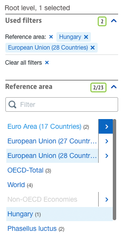
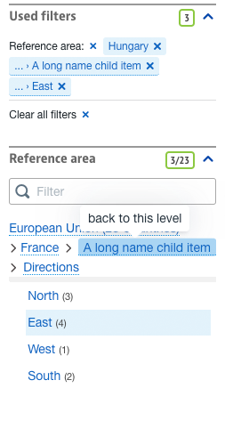
Hover and selection
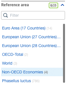
hover
background: default - light;
color: primary;

numbers color:
color: TXT - light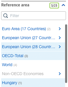
active-selected
background: default - light;
color: primary;
active-selected hover
background: default - dark;
color: primary;
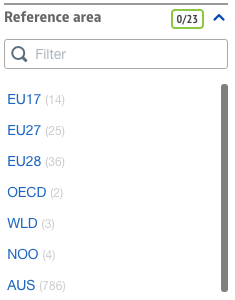
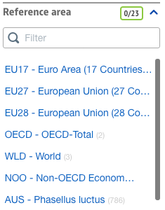
Scopelist
- the arrow area is separated from the items labels list, it behaves like a separate button
- the arrow area and the list items have separate hover/active states
border:
1px solid TXT - light

arrow hover:
background: primary;
color: white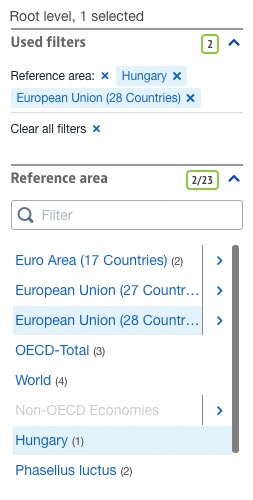
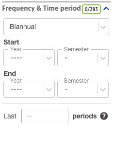
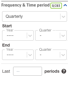
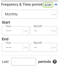
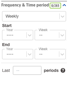
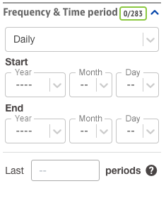
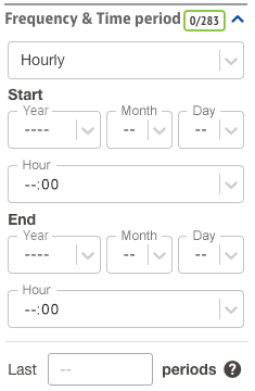
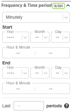
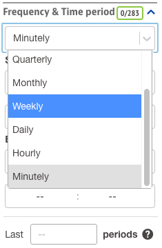
Frequency

Views (code, label, both)
code
color: Neutral darken-1;
width: 45px;
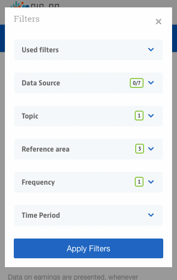
Mobile
Filter button:
button secondary large

Badge:
right: 24px;
vertical-align: middle;
- Filters are collapsed in mobile view
- it shows with badge how many filters are selected
Modal overlay background:
background-color: rgba(0,0,0,0.4);

Modal box:
background: white;
margin: 10px auto;
padding: 18px;
width: 95%;
position: relative;

Filters text:
font-size: 17px;
color: Muted;
font-family: 'Roboto Slab', serif;
font-weight: 400;

Cancel icon:
position: absolute;
top: 18px;
right: 18px;
font-size: 25px;
color: Muted;

Filter dropdown buttons:
font-size: 15px;
font-family: "PT Sans Narrow", "Helvetica Neue", Helvetica, Arial, sans-serif;
font-weight: bold;
color: TXT - light;
line-height: 40px;
padding: 0 16px;
margin-bottom: 25px;

Apply button:
button primary large
- Filters open in modal box
- Filter categories are collapsed
- Badges show how many filters are selected
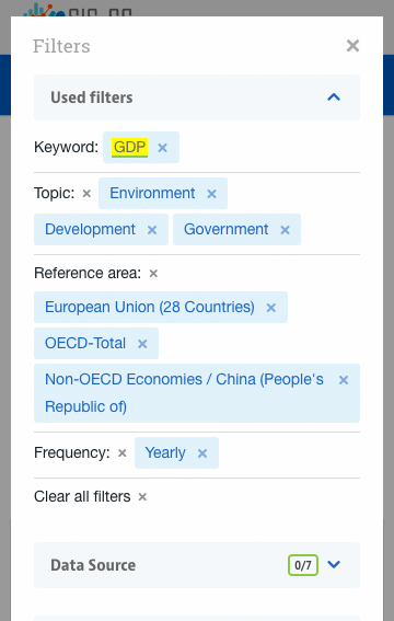
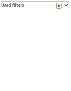
Used filters:
line-height: 25px;
font-size: 14px;
- same as in desktop view, only the height of the items changes for touchability
Filters list item:
height: 50px;
- same as in desktop view, only the height of the lines changes for touchability